Отображение отчетов с диаграммами/en: различия между версиями
Новая страница: «Displaying Reports with Charts» |
Нет описания правки |
||
| (не показаны 2 промежуточные версии этого же участника) | |||
| Строка 1: | Строка 1: | ||
== Description of the Situation == | |||
SmartPlayer platform users now have the ability to view a completed report in the form of various types of charts. This solution makes the information contained in the report easier to perceive and read. | |||
== How It Works == | |||
== | {{Note|To access this functionality, the user must first create a "Report." For a better understanding of how to correctly create a report as a user, it is recommended to review the following articles: | ||
{{Note| | * [[Section "Reports"]] |warn}} | ||
* [[ | After logging into the personal account and creating a report, the user needs to go to the "Reports" section and select the "Generated Reports" category. This category is automatically selected when you click on the "Reports" section. | ||
[[File:Сформированный_отчеты.png|thumb|center| Example of the "Reports" section and "Generated Reports" category in the user's personal account |800px]] | |||
[[File:Сформированный_отчеты.png|thumb|center| | Once the new "Reports" section page is opened, the user needs to select one of the successfully generated reports.<br> Report types: | ||
# A successfully generated report is marked with a green circle icon. | |||
# A report that was not generated has a red circle icon. [[File:Типы_отчетов.png|thumb|center| Example of different types of reports in the personal account |800px]] | |||
# | After selecting a successfully generated report with a mouse click, the user needs to move to the right toolbar that appears and select the "Show" option. | ||
# | [[File:Функция_показаить.png|thumb|center| Example of the right toolbar with settings for the completed report |800px]] | ||
[[File:Типы_отчетов.png|thumb|center| | Clicking on the "Show" option will open a new page with charts related to the report. | ||
[[File:Страница_отчета.png|thumb|center| Example of the report details page with charts |800px]] | |||
[[File:Функция_показаить.png|thumb|center| | === Information Displayed on the Page === | ||
When the page with charts is opened, the user can access the following information: | |||
[[File:Страница_отчета.png|thumb|center| | # The name of the device for which the report was generated. | ||
# The type of chart used for the report (can be: line, bar, ring). | |||
# The parameter by which the chart is displayed. [[File:Параметры_отчета.png|thumb|center| Example of how the report details page is divided |800px]] | |||
=== Interacting with Charts === | |||
The user has access to three types of charts for interacting with the report: | |||
# | * Line Chart - Displays report data in the form of a line graph. [[File:Пример_линейная.png|thumb|center| Example of a line chart for reports |800px]] | ||
# | * Bar Chart - Displays report data in the form of a bar graph. [[File:Пример_столбчатая.png|thumb|center| Example of a bar chart for reports |800px]] | ||
# | * Ring Chart - Displays report data in the form of a circular chart with multiple levels. | ||
[[File:Параметры_отчета.png|thumb|center| | [[File:Пример_кольцевая.png|thumb|center| Example of a ring chart for reports |800px]] | ||
=== | === Filtering Indicators === | ||
When using any of the charts, a color "legend" of the displayed indicators will be used. [[File:Пример_легенды.png|thumb|center| Example of a color legend for charts |800px]] If you click on one of the indicators with the mouse, it will appear crossed out and will be removed from the chart being viewed. [[File:Отключение_легенды.png|thumb|center| Example of a removed "legend" item on the chart |800px]] | |||
* | == Video Guide == | ||
[[File:Пример_линейная.png|thumb|center| | [https://www.youtube.com/watch?v=jyHW8lRGQWo Displaying Reports with Charts] | ||
* | == Additional Information == | ||
[[File:Пример_столбчатая.png|thumb|center| | If this article does not help you use the functionality as intended, or if you have any questions after reading it, you can ask them in the "Discussion" section at the top of the page. [[File:Обсуждение_диаграм.png|thumb|center| Example of the "Discussion" tab on the wiki page |800px]] | ||
* | |||
[[File:Пример_кольцевая.png|thumb|center| | |||
=== | |||
[[File:Пример_легенды.png|thumb|center| | |||
[[File:Отключение_легенды.png|thumb|center| | |||
== | |||
[https://www.youtube.com/watch?v=jyHW8lRGQWo | |||
== | |||
[[File:Обсуждение_диаграм.png|thumb|center| | |||
Текущая версия от 10:12, 26 августа 2024
Description of the Situation
SmartPlayer platform users now have the ability to view a completed report in the form of various types of charts. This solution makes the information contained in the report easier to perceive and read.
How It Works
After logging into the personal account and creating a report, the user needs to go to the "Reports" section and select the "Generated Reports" category. This category is automatically selected when you click on the "Reports" section.

Once the new "Reports" section page is opened, the user needs to select one of the successfully generated reports.
Report types:
- A successfully generated report is marked with a green circle icon.
- A report that was not generated has a red circle icon.

Example of different types of reports in the personal account

After selecting a successfully generated report with a mouse click, the user needs to move to the right toolbar that appears and select the "Show" option.

Clicking on the "Show" option will open a new page with charts related to the report.

Information Displayed on the Page
When the page with charts is opened, the user can access the following information:
- The name of the device for which the report was generated.
- The type of chart used for the report (can be: line, bar, ring).
- The parameter by which the chart is displayed.
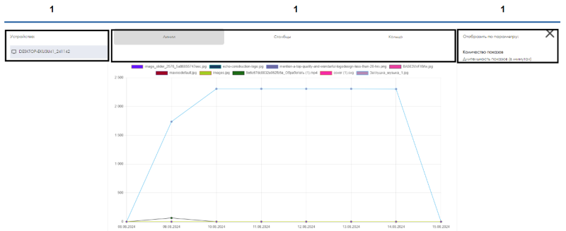
Example of how the report details page is divided

Interacting with Charts
The user has access to three types of charts for interacting with the report:
- Line Chart - Displays report data in the form of a line graph.
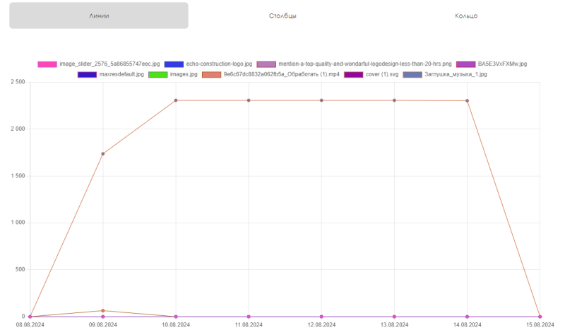
Example of a line chart for reports - Bar Chart - Displays report data in the form of a bar graph.
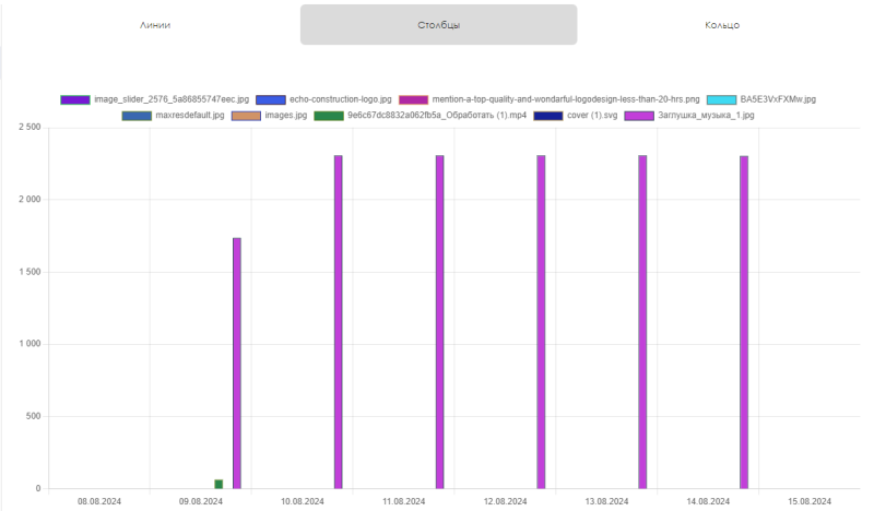
Example of a bar chart for reports - Ring Chart - Displays report data in the form of a circular chart with multiple levels.


Filtering Indicators
When using any of the charts, a color "legend" of the displayed indicators will be used.

If you click on one of the indicators with the mouse, it will appear crossed out and will be removed from the chart being viewed.

Video Guide
Displaying Reports with Charts
Additional Information
If this article does not help you use the functionality as intended, or if you have any questions after reading it, you can ask them in the "Discussion" section at the top of the page.

