Instructions for working with the news ticker widget
Widget Description
This widget is a feature that allows real-time display of information from news sources in two modes:
- Static news with graphical content
- Ticker mode
The widget receives information via a URL link, which serves as its source, and displays the retrieved news on the screen as a news block. Using the widget settings, users can customize the news display on the device to be unique and tailored to their specific needs. == Adding the Widget to the Personal Account == To add this widget to the personal account, the user needs to request the widget from the team specialist. It will be provided as a ".zip" archive.

Afterward, the user should log into the personal account and go to the "Content" section.

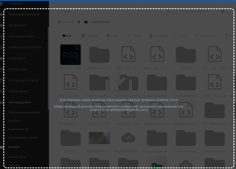
In the "Content" section, the user needs to drag and drop the widget from local storage into the "Content" section. Once the user adds the widget to the personal account, it will appear in the content list.


Widget Settings
After transferring the widget to the "Content" section, to configure the widget for the first time, the user needs to double-click the widget icon. This action will take them to the widget’s main page.

On the widget’s main page, the user can access the widget’s settings by clicking on the gear icon.

Widget Configuration Parameters
The following parameters can be used to configure the widget:
General settings block:
- Language selection – allows the user to choose the language in which the widget interface will be displayed. The current implementation supports two languages: Russian and English.
- Resource URL – allows specifying the URL link to the news portal from which the widget will retrieve the news block. This link should point to an RSS resource provided by the server in XML format.
- Color slider – allows the user to choose a color scheme with two gradient options for displaying news (more details below). If at least one color slider is active, the "Background image" option for the news will be disabled as it will be replaced by the slider.
- Background image – allows the user to select a graphic content as the widget’s background. This option does not work if at least one color slider is active.
- Animation – allows the user to choose the animation for news transitions. Two types of animations are available: fade (animation with a gradually disappearing background) and slide (sliding animation from right to left).
- Content change delay – measured in seconds, this allows the user to set the speed of the news change using a numerical value.
- Disable images checkbox – when activated, this disables the display of news with images, leaving only the text. If this checkbox is deactivated, the news will display with an image (if available).
- Autoscroll checkbox – when activated, autoscroll will be enabled for large news articles that do not fit on the screen.

Block "Settings for text information when ticker mode is disabled":
- Text positioning – allows the user to choose where the news text will be positioned on the screen. Currently, two options are available: centered or at the top of the page. This does not work in ticker mode.
- Static news text color – allows the user to select the color of the news text. The color can be specified using a HEX code available online.
- News text font size – allows the user to specify a numerical value for the news text font size.
- Image width – measured in pixels, this allows the user to specify the width of the news image.
- Image height – measured in pixels, this allows the user to specify the height of the news image.
- Image margin – measured in pixels, this allows the user to set the margin distance for the image. The margin applies from the left side of the screen.
- RSS channel tag – this setting points to the XML tag that the widget will use to retrieve the news text. Currently, three tags are supported: description, content, and title.

Block: "Settings for ticker mode":
- Ticker mode checkbox – when activated, this allows the user to enable ticker mode for the news text. It removes the news image and scrolls the current news in a single line.
- Ticker speed – can range from "0" to "1000", allowing the user to set the speed of the ticker’s appearance and scrolling.
News separator symbol – allows the user to specify a symbol that will be used to separate news articles. Recommended symbols include: (".") (",") ("/").
- News text spacing – allows the user to specify the pixel distance between news articles and the separator symbol. The spacing applies to both the current and next news articles, keeping them equidistant from the separator.
- Ticker text color – allows the user to select the color of the ticker text.
- Ticker font size – allows the user to specify a numerical value for the ticker font size.
- Ticker direction – allows the user to choose the direction of the ticker movement. Two options are available: left to right and right to left.
- Ticker margin – measured in pixels, this allows the user to set the margin for the ticker relative to the left and right sides of the screen.

Color Slider
The color slider allows the user to select how the background for the news will be displayed and how many backgrounds will be used for the news.
To add a background, the user needs to click "Add color."

Once added to the settings screen, the slider’s color palette allows the user to customize the news display to their needs. Palettes can be added without limitations, but they will change along with the news.
If the number of palettes is fewer than the number of news articles, the palette will restart when the news articles loop.
Color Display Settings
All slider palettes have the option to create a gradient transition. The user can set any number of gradient points by clicking on the gradient panel.

By selecting the desired point with a mouse click, the user can assign it a specific color. When a point is not selected, it appears as an unfilled white circle. When selected, it appears as a filled white circle.

There are two types of gradient displays available to the user:
- Bottom to top – this gradient allows for changing the direction using a "rotator" (you can also specify the direction in degrees).

Example of the first gradient option - Center to edge – this gradient spreads the color transition from the center outward.

Example of the second gradient option
After adding one slider module, the user can customize the color scheme for the background. Colors can be selected using:
- Palette – the color is chosen from the palette using the mouse.
- HEX code – the user enters the desired color's HEX code available online.
- RGB panel – numerical values for each primary color can be set using the RGB panel available online.

The user also has access to a brightness slider that allows adjusting the brightness and saturation of the color. As an alternative to the slider, the "Alpha" parameter can be used, which also controls brightness.

Adding the Configured Widget to a Broadcast
To fully explore the functionality, the user needs to start a scheduled broadcast and add this widget as content. To review the steps mentioned earlier about creating a broadcast and schedule, it is recommended to read the following Wikipedia articles:
== Video Tutorial == Configuring the dynamic news display widget via RSS
Additional Information
If this article does not help in using the functionality as intended or if there are any questions after reading, they can be asked in the "Discussions" section at the top of the page.

Additional information can also be found on the page Как взаимодействовать пользователю с разделом "Обсуждения".
