Виджет авторизации/en: различия между версиями
Новая страница: «== '''Working with the Widget''' == === '''Widget Configuration''' === thumb|center|Example of accessing the settings section|800px {{Note|The widget configuration is performed only after all the steps mentioned above in the article have been completed.|warn}} When the user opens the widget, they will see areas on the screen that can be moved.<br> In the top right corner, the user needs to click on the "gear/s...» |
Нет описания правки |
||
| (не показана 1 промежуточная версия этого же участника) | |||
| Строка 11: | Строка 11: | ||
* Launch the widget following the instructions and enter the necessary data | * Launch the widget following the instructions and enter the necessary data | ||
* Authenticate using the widget and use the content from the site in your broadcast within SmartPlayer | * Authenticate using the widget and use the content from the site in your broadcast within SmartPlayer | ||
[[File:Логика | [[File:Логика.png|thumb|center| Widget operating logic|800px]] | ||
{{Note| If the user is using a laptop, pressing "F11" might not result in any action. This is because the operating system may have "Function key lock" enabled by default. In such cases, to expand the browser window, press "Fn + F11".|warn}} | {{Note| If the user is using a laptop, pressing "F11" might not result in any action. This is because the operating system may have "Function key lock" enabled by default. In such cases, to expand the browser window, press "Fn + F11".|warn}} | ||
== '''Widget Setup''' == | == '''Widget Setup''' == | ||
| Строка 50: | Строка 50: | ||
[[File:Нужные поля.png|thumb|center|Fields that must be filled in|800px]] | [[File:Нужные поля.png|thumb|center|Fields that must be filled in|800px]] | ||
[[File:Применить настройки.png|thumb|center|Fields for selecting content sources and applying settings|800px]] | [[File:Применить настройки.png|thumb|center|Fields for selecting content sources and applying settings|800px]] | ||
=== '''Interaction with Backgrounds''' === | |||
=== ''' | The user selects the screenshot with the login. This screenshot is usually labeled as "Screenshot 1". In this screenshot, align the outlines of the "login" window and place it in the "login" field on the screenshot.<br> | ||
The next step is to align the "Next" button with the "Next" field.<br> | |||
Switch to the next screenshot, "Screenshot 2". The user also aligns the "password" field with the "password" field on the screenshot.<br> | |||
Click the "Next" button on the password screenshot and place "Authorize".<br> | |||
Then click the "Save" button.<br> | |||
The final step is for the user to name the broadcast, save it, and launch it on the device. | |||
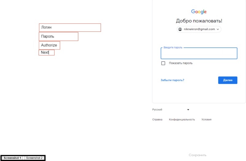
[[File:Окно.png|thumb|center|Background where fields are aligned and backgrounds are switched|800px]] | |||
[[File:Окно.png|thumb|center| | === '''Widget Appearance''' === | ||
=== ''' | The widget uses the screenshot area as the workspace. It consists of four blocks: | ||
* Login - a rectangular area with data. The email is inserted into this line. Align it with the "login" area on the screenshot. | |||
* Password - a rectangular area with data. The password is inserted into this line. Align it with the "password" area on the screenshot. | |||
* Authorize - a rectangular area that clicks the button (clicker). Align it with the "authorize" button on the screenshot. | |||
* Next - a rectangular area that clicks the button (clicker). Align it with the "next" button on the screenshot. | |||
* Click - a rectangular area that allows for an additional click action anywhere on the widget. | |||
[[File:Кнопки_скринов.png|thumb|center|Example of the authorization widget areas|800px]] | |||
[[File:Кнопки_скринов.png|thumb|center| | == '''Video Instruction''' == | ||
== ''' | == '''Final Outcome''' == | ||
== ''' | Users of this functionality will be able to automatically authenticate on their website and use the content they need from their site. | ||
Текущая версия от 10:42, 14 мая 2024
Situation Description
A user may want to use content from their own website as broadcast content. To incorporate this content into the broadcast, they will likely need to go through an authentication process on their site. To avoid manual authentication and fully automate the process, an authentication widget was created.
Widget Operating Logic
- Prepare the broadcast
- Copy the URL link from the required web page for authentication
- Expand the login input window using the "F11" key and take a screenshot
- Similarly, expand the password input window using the "F11" key and take a screenshot
- Log into the SmartPlayer personal account and create a folder in the "Content" section for the screenshots
- Launch the widget following the instructions and enter the necessary data
- Authenticate using the widget and use the content from the site in your broadcast within SmartPlayer

Widget Setup
The authentication widget is set up by the user upon entry. The Google authentication page will be used as an example.
Obtaining the Widget
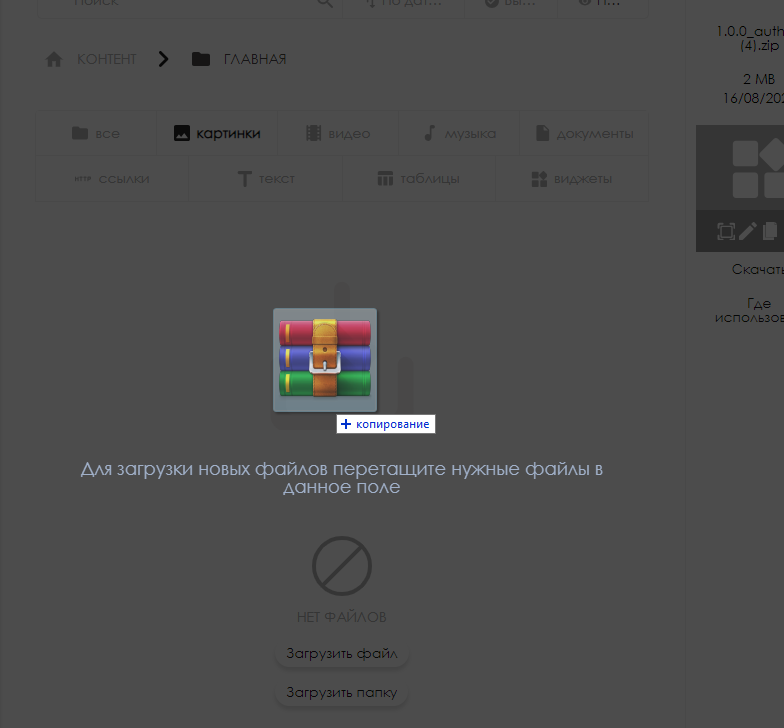
The user receives the widget in the form of an archive. This archive is integrated into the personal account.
To add the widget archive, go to the "Content" section and the "Widgets" tab. Embedding is done by dragging and dropping the archive from the repository where it is stored into the personal account window.
After this, the widget will be stored within the user's personal account.
Creating a Broadcast
Before using the widget, the user needs to create a broadcast into which the widget will be placed. Detailed information on creating a broadcast can be found on the Раздел "Трансляции" page.
Adding the Widget
Once the user has set up the broadcast, they need to add the widget.
- The user clicks on the workspace and finds the "content" line on the right side of the screen. This line features several folders with sorted content and the main folder with all content uploaded to the system.
- In the list, select the required widget. Using drag-and-drop, move it to the workspace.
- In the "Content Settings" tab on the right side of the screen, set the duration to 10400 seconds.


Preparing the Background
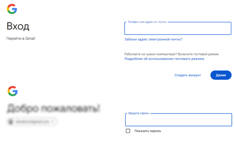
Open the Google authentication page in the browser and enable full-screen mode (default is F11). Then take a screenshot of the expanded screen.
The next step is to enter the login and go to the password entry page, similarly taking a screenshot of the screen.
Create a separate folder in the "Content" tab and add the created screenshots.
Working with the Widget
Widget Configuration

When the user opens the widget, they will see areas on the screen that can be moved.
In the top right corner, the user needs to click on the "gear/settings" icon to open the widget settings window.
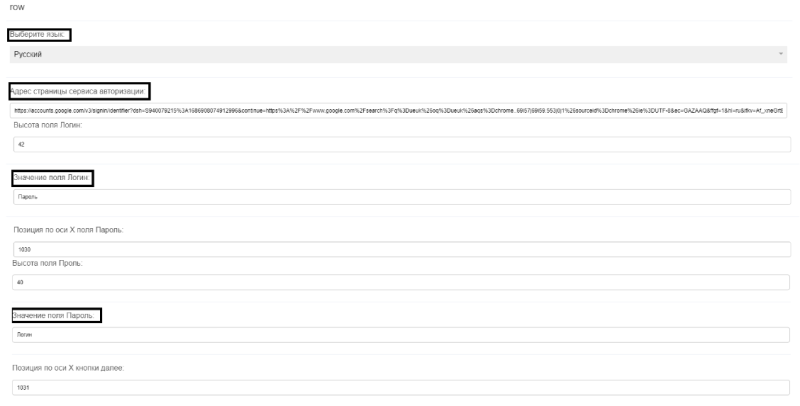
In the opened settings list, it is necessary to specify the following (all values are given in pixels "px"):
- The address of the authentication page.
- Fill in the "Login Field Value" and "Password Field Value" fields. Alternatively, you can fill in the data on the background screen.
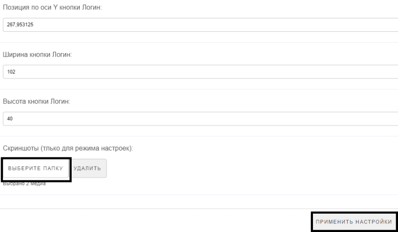
- Scroll down the settings page and select the folder where the screenshots of the authentication page with the login and password are stored. Be sure to click the "Save" button and then the "Apply Settings" button.
- After saving the settings, the screenshots and their fields will be displayed, with the data specified in the settings indicated in the fields.
- A background screenshot toggle will appear in the bottom left.
Interaction with Backgrounds
The user selects the screenshot with the login. This screenshot is usually labeled as "Screenshot 1". In this screenshot, align the outlines of the "login" window and place it in the "login" field on the screenshot.
The next step is to align the "Next" button with the "Next" field.
Switch to the next screenshot, "Screenshot 2". The user also aligns the "password" field with the "password" field on the screenshot.
Click the "Next" button on the password screenshot and place "Authorize".
Then click the "Save" button.
The final step is for the user to name the broadcast, save it, and launch it on the device.
Widget Appearance
The widget uses the screenshot area as the workspace. It consists of four blocks:
- Login - a rectangular area with data. The email is inserted into this line. Align it with the "login" area on the screenshot.
- Password - a rectangular area with data. The password is inserted into this line. Align it with the "password" area on the screenshot.
- Authorize - a rectangular area that clicks the button (clicker). Align it with the "authorize" button on the screenshot.
- Next - a rectangular area that clicks the button (clicker). Align it with the "next" button on the screenshot.
- Click - a rectangular area that allows for an additional click action anywhere on the widget.

Video Instruction
Final Outcome
Users of this functionality will be able to automatically authenticate on their website and use the content they need from their site.