Instruction for Working with the Complex Widget
Widget Description
The Complex Widget is a solution that allows users to display their own content in a broadcast and add informational blocks to it. These informational blocks are other widgets integrated into it as a solution:
- Time and Date (located in the top-left corner)
- Weather (located in the center of the screen)
- RSS feed (scrolling ticker at the bottom) with information from the Lenta.RU website
Additionally, a company logo is displayed in the top-right corner of the screen.
Adding the Widget to the Personal Account
To add this widget to the personal account, the user needs to request it from a SmartPlayer technical support specialist. It will be provided as a ".zip" archive.

Next, the user must log in to their personal account and go to the "Content" section.

In the "Content" section, the widget must be dragged from local storage into the "Content" area. After the user uploads the widget to the personal account, it will appear in the content list.
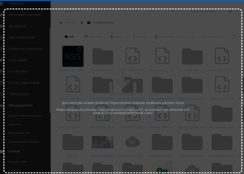
Widget Configuration
To perform the initial widget setup, the user needs to double-click the widget icon. This will take them to the main page of the widget.
On the widget’s main page, users can access the widget settings by clicking the gear icon in the top-right corner.
Widget Configuration Parameters
After clicking the settings icon, a configuration page will open.
All configuration parameters are divided into four groups: 1. General 2. Time and Date 3. Weather 4. Logo Detailed descriptions of each group are provided below.
General
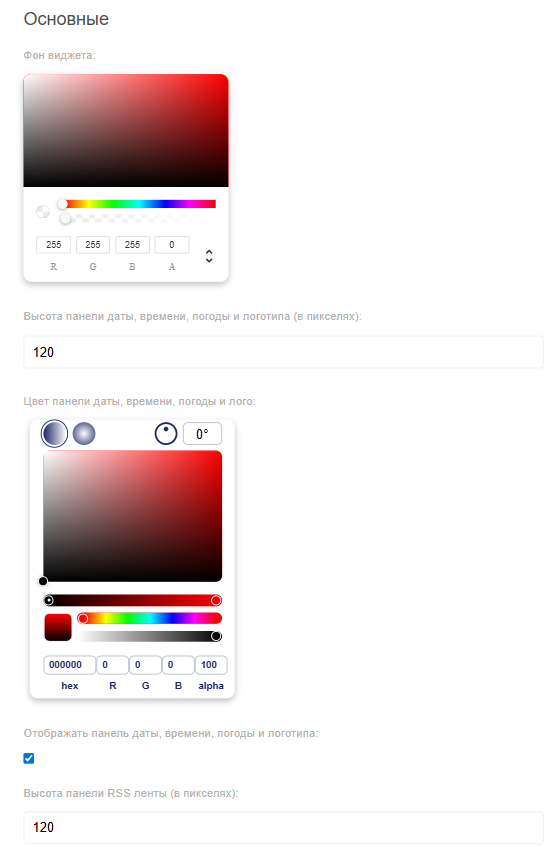
The general settings include the following parameters:
- Widget background — allows selecting a background color using the color picker. A HEX code can also be entered;
- Height of the time, date, weather, and logo panel — sets the panel height in pixels (px);
- Color of the time, date, weather, and logo panel — sets the color using the palette or HEX code, with transparency and gradient options;
- Checkbox "Display panel with time, date, weather, and logo" — enables/disables panel display in the widget;
- RSS feed panel height — sets the height of the RSS feed panel in pixels (px);
- RSS feed panel color — sets the color using the palette or HEX code, with transparency and gradient options;
- Checkbox "Display RSS feed panel" — enables/disables the RSS panel;
- Panel arrangement — defines the order of information display.
Time and Date
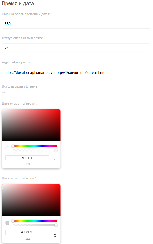
The "Time and Date" settings block includes:
- Width of the time and date block — sets block width in pixels (px);
- Left margin — sets the left-side offset in pixels (px);
- NTP server address — enter the NTP server URL;
- Checkbox "Use NTP server" — enables/disables the use of NTP server;
- "Time" element color — choose color using the palette or HEX code;
- "Location" element color — choose color using the palette or HEX code;
- "Date" element color — choose color using the palette or HEX code;
- "Day of week" element color — choose color using the palette or HEX code;
- Font size for the "Time" element — can be adjusted via slider or manual input;
- Font size for the "Location" element — can be adjusted via slider or manual input;
- Font size for the "Date" element — can be adjusted via slider or manual input;
- Font size for the "Day of week" element — can be adjusted via slider or manual input;
- Block transparency — enter value 1 (opaque) or 0 (fully transparent);
- Checkbox "Display time and date" — enables/disables this panel in the widget.
Weather
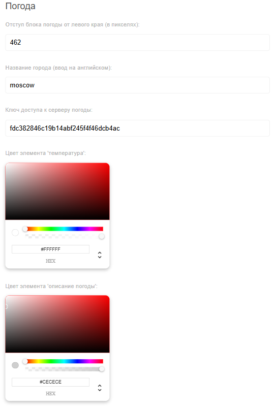
The "Weather" settings block includes the following parameters:
- Weather block left margin — sets the offset value in pixels (px);
- City name — enter the city name in English;
- API key for the weather server — key for connecting to the OpenWeather service;
- "Temperature" element color — choose the color using the palette or a HEX code;
- "Weather description" element color — choose the color using the palette or a HEX code;
- "Daily forecast" element color — choose the color using the palette or a HEX code;
- "Temperature" font size — adjustable via slider or manual input;
- "Weather description" font size — adjustable via slider or manual input;
- "Daily forecast" font size — adjustable via slider or manual input;
- Block transparency — set to 1 (fully opaque) or 0 (fully transparent);
- Checkbox "Display weather" — enables/disables weather panel display in the widget.
Logo
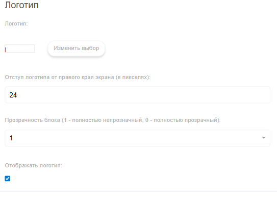
The "Logo" settings block includes the following parameters:
- Logo — allows selecting the desired logo from the content stored in the personal account;
- Logo right margin (in pixels) — set the offset value in pixels (px);
- Block transparency — set to 1 (fully opaque) or 0 (fully transparent);
- Checkbox "Display logo" — enables/disables logo display in the widget.
News Ticker (Scrolling Text)
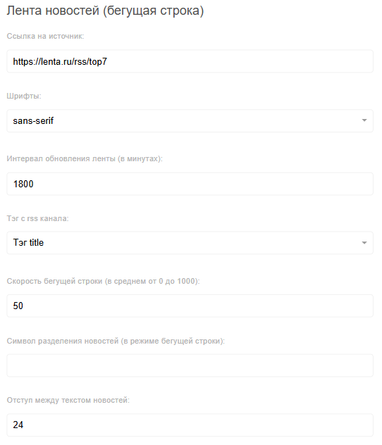
The "News Ticker (Scrolling Text)" settings block includes:
- Source URL — enter the RSS feed source address;
- Fonts — select a font type from the available list;
- Feed refresh interval — specify how often the feed should update, in minutes;
- RSS tag — choose which RSS tag to use in the widget. Available options: title, description, content;
- Ticker speed — enter the scroll speed value;
- Spacing between news items — set the pixel (px) spacing between items;
- News item separator character — enter a character that will separate the processed news items;
- Ticker text color — choose the color using the palette or HEX code;
- Ticker font size — specify the font size in pixels (px);
- Ticker direction — select from the list: left or right;
- Checkbox "Display RSS ticker" — enables/disables ticker display in the widget.
Configured Widget
After configuration is complete, the widget may appear as shown below:
Finalizing Widget Settings

Then the widget will expand to full screen and the user must click the "Save" button at the bottom center of the screen.

Loading and Saving Settings
While interacting with the widget, the user can load or save widget settings. Each of these actions can be performed using the corresponding icons in the widget interface. The icons are located at the bottom center of the widget.

Adding the Configured Widget to a Broadcast
To fully understand how this functionality works, the user should start a scheduled broadcast and add this widget as content. To review the previously described steps for creating a broadcast and schedule, refer to the following articles:
Video Instruction
Configuring the Complex Widget
Additional Information
If this article does not help you use the functionality as intended, or if you still have questions after reading it, feel free to raise them in the "Discussions" section at the top of the page.

Additional information can also be found on the page Как взаимодействовать пользователю с разделом "Обсуждения"